Data Science in Astronomy: Intro and scikit-learn
An overview of jargon, plus multi-band detection by clustering in color space
Before we dive in, a little jargon.
Often, we describe images or catalog features by what we call a "measurement", which is a pre-defined function of the data, but the term is somewhat overloaded. Let's have a closer look.
In statistics, a predefined function evaluated for a sample is called a sample statistic. That statistic may be regarded as an estimator of a parameter of the underlying model or parameterization of the population from which samples are drawn. It can also be used for a hypothesis test about the sample.
Example: If we have a noisy image of a star , we can form the statistic (a sum over all pixels ), which is an estimator for the true flux of the star , and can be used to test how likely it is that is the image of a star with true flux .
Data Science happens at the level of sample statistics, or in our jargon: at the catalog level (I'll break that rule below..), i.e. once the measurement has been made. It doesn't deal with defining the statistic, instead it seeks to characterize the underlying populations based on multiple statistics of typically large numbers of samples.
The analysis approaches fall into two large groups:
- Supervised techniques are based on data, for which independent and dependent variables/features are known, i.e. there are samples of the mapping . The task is then to learn the mapping. Again, two types arise:
- is the space of continuous variables, typically or . This is colloquially known as "fitting a model to data" and officially as regression.
- is finite set of class labels, and each sample is assumed to belong to one class. The task is then called, well, classification.
- Unsupervised techniques are those for which only samples are available. The goal is then to describe their distribution in (density estimation) or their labeling (clustering). One can therefore think of these tasks as equivalent to the supervised ones, but with the additional complication that the "output" of the mapping is never observed. For instance, density estimation wants to find the mapping , where refers to the probability density distribution of the .
Another set of techniques is often required to aid the ones above, namely those for dimensionality reduction. It's often easier to perform analyses in low-dimensional spaces, which is why high-dimensional spaces are said to be cursed. Think of looking at data by eye, where we can work in 2D or 3D, but if we want to inspect even more features we need to map them onto graphical characteristics, like shape or colors of markers. The key of dimensionality reduction is to determine which aspects of the data are not important. If there are relations between features in the data, one can transform the feature space into one with a lower dimension. The crux is to know or guess the type of relations to determine which transformation is best.
Examples:
- All scaling relations in astronomy!
- Slightly more complicated: The HR diagram clearly shows structure, but the relations aren't linear or power-law-like everywhere.

Scikit-learn
Here's the fun part… scikit-learn is a single python package that implements all of the above. You may find that specific methods are missing, but overall it really covers the bases with a common interface. Data can be handled as numpy arrays, scipy sparse matrices, and pandas DataFrames. That makes scikit-learn powerful for smaller analyses and fast exploration. Moreover it's very well documented with a neat tutorial.
If you feel a little overwhelmed by the options, their algorithm cheat sheet (more a decision tree, really) is quite useful:
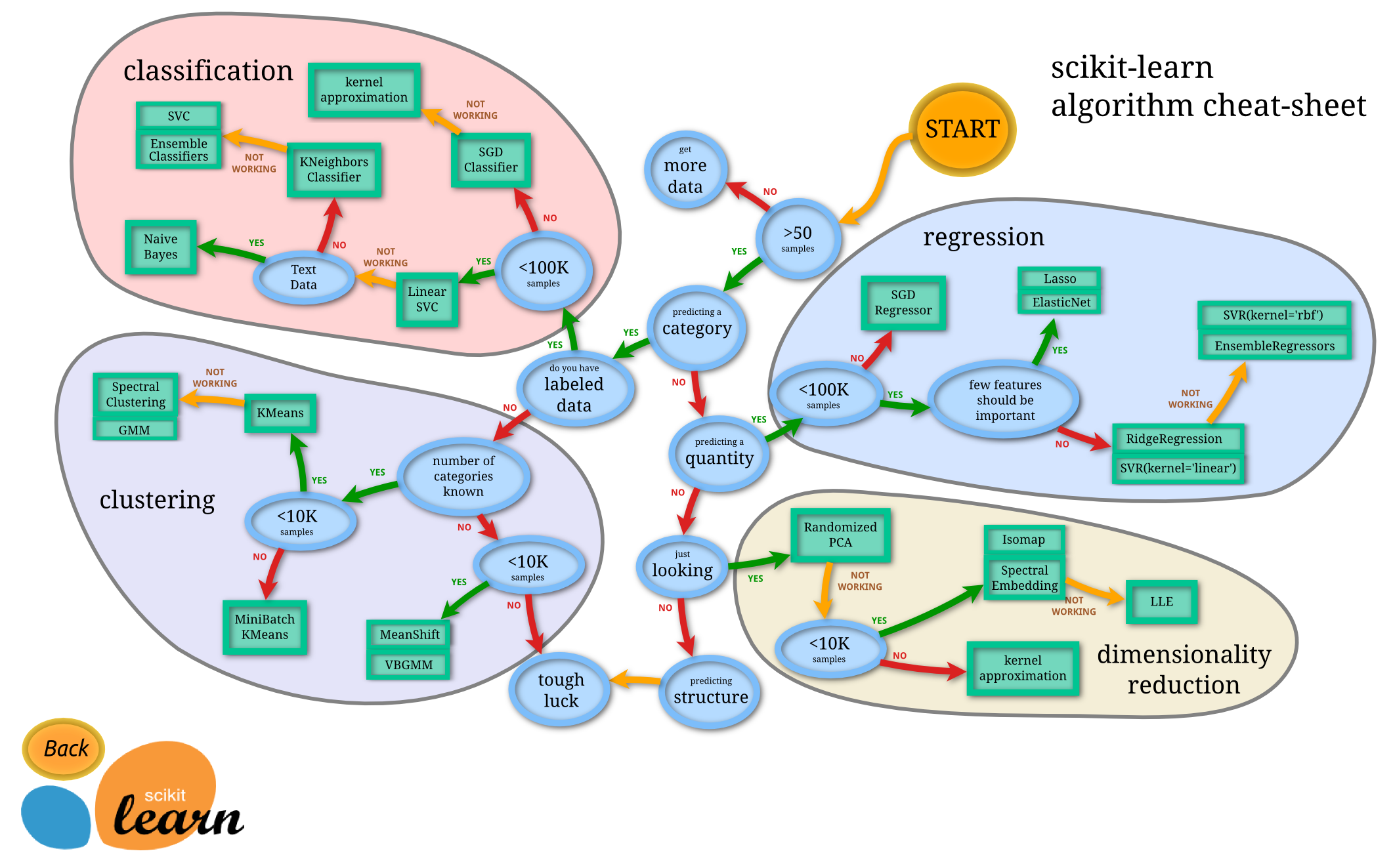
Note the split at the 3rd node "predicting a category". In this tree it happens before the question whether the data are labeled (the supervised—unsupervised divide). That is in line with treating unsupervised methods similar to those that are supervised, but with response variables ("labels") that are never observed. Also, this chart doesn't include density estimation, the unsupervised cousin of regression.
Multi-band detection by pixel-level clustering
[This is not a thorough application, more a quick test if the idea has merit. And we'll do some serious harm to error propagation… Anyway the notebook is available here].
Traditionally astronomical image analysis is performed in individual bands. You take an image, say in the optical band, detect objects there, and determine their properties. If you have multiple bands, you repeat the process for each band. That's weird because we naturally expect images to have colors. What if we did our analyses on multi-band image cubes? We'd have more information and access to alternative ways of looking at the data. And we could play with analysis methods that are often associated with catalog-level data, but this time we use them directly on pixels.
I will attempt to do detection and segmentation (finding out which pixel belong to which object) by looking for pixels with similar colors. According to the decision tree above, the task is clustering in a suitable color space. I made an example image with 3 objects in a 3-band image cube (which you can download here.) The left panel below is the traditional way of looking at it as false-color image (with a visually pleasing arcsinh stretch), which is ordered by pixel position. The right panel shows the same data, but now ordered by intensity in ; each dot is one pixel.
|  |
|  |
| ---------------------------- | ---------------------------------- |
| | |
|
| ---------------------------- | ---------------------------------- |
| | |
One can see three distinct groups of pixels, distributed along straight lines of different direction. That's because the relative amplitude in different bands is the same (modulo noise), but the overall intensity is changing. The brightest pixels of each object is at the tip of each branch. The three branches merge in one common point, which is the sky intensity.
Pixel colors are directions in intensity space, scaled by luminosity.
Before we attempt a clustering analysis, we might want to do a dimensionality reduction. After all, these straight lines are entirely predictable. I tried several methods from scikit-learn, but none worked satisfactorily. If someone knows a reduction technique in scikit-learn that compresses those linear branches to points, let me know! In the meantime, we have to think of something else.
A transformation that nulls the intensity variation is to normalize by the sum of intensities in all bands : Now all samples have in intensity space, a constraint that is called a simplex. But we're still in 3D. However, since the "length" of the intensity vectors is irrelevant, only the direction matters. We can go the origin of the intensity space, in the right image above, and project out the length direction. That's equivalent to looking at the sky and ignoring the distances to all stars/galaxies. I will call the resulting space the color space.
import numpy as np
img = np.load("3-band-example.npy")

def simplex_projection(img):
    # normalize total intensity
    img_tot = img.sum(axis=0)
    # yeah: division by zero happens here!
    v = img.astype('float') / img_tot[None,:,:]

    # build basis of simplex
    d = img.shape[0]
    basis = np.zeros((d,d))
    # set normal on simplex
    basis[:,0] = 1
    for i in xrange(1,d):
        basis[0,i] = -1
        basis[i,i] = 1
    q,r = np.linalg.qr(basis)

    # remove projection onto normal
    w = q[:,1:].T
    v = np.einsum('ij,j...', w, v)
    return v

# project 3-band data onto 2-dim simplex
v = simplex_projection(img)
v = v.reshape(-1,2)
# plot the 2D distribution: surface of simplex
plt.figure()
plt.scatter(v[:,0], v[:,1], alpha=0.1)
plt.xlabel('$v_1$')
plt.ylabel('$v_2$')
plt.tight_layout()
|  |
|  |
| ----------------------------------------- | -------------------------------- |
| | |
|
| ----------------------------------------- | -------------------------------- |
| | |
The big blob in the center of the left panel is the color of the sky. I used 100 counts in every band, so the sky color is gray, and it's at the center of the simplex. Every color in the image is a mixture of the sky color and the color of one or several objects, the relative ratios create the branches in the left panel. The brightest pixels of each objects are still at the tips of the branches.
To get rid of the sky, one can subtract it before projecting onto the simplex. But that causes the mean of the denominator of the simplex normalization to be zero! Division by zero or very small numbers is usually not a good idea, but let's try anyway. What you get is the right panel above if you trim it to 2D distances of <0.75 (that number is hand-picked).
# for better separation: remove the sky
v = simplex_projection(img-sky)
v = v.reshape(-1,2)
# exclude "bad" pixels
sel = np.isnan(v[:,0]) | np.isnan(v[:,1])
# prune the noise
noise_thresh = 0.75
sel |= (v**2).sum(axis=1) > noise_thresh
v_ = v[~sel]
There are many outliers (black markers) whose color are very close to the sky, so their color after subtraction becomes rather ill-defined. Nonetheless, the brighter pixels here form three groups, two of which quite strongly overlap. But that should be good enough to run a simple clustering algorithm. Following the decision tree I picked the simplest one, -means, from scikit-learn:
from sklearn import cluster
kmeans = cluster.KMeans(n_clusters=3)
labels = kmeans.fit_predict(v)
OK, that was easy. But was it any good?
|  |
|  |
| --------------------------------------- | -------------------------------------- |
| | |
Well, -means found a clustering in color space that looks plausible. I used the colors that correspond to the ones in the original image. I ran this a few times and the only aspect that changes is the boundary between the cyan and blue cluster. Not surprising, since these objects have similar colors.
|
| --------------------------------------- | -------------------------------------- |
| | |
Well, -means found a clustering in color space that looks plausible. I used the colors that correspond to the ones in the original image. I ran this a few times and the only aspect that changes is the boundary between the cyan and blue cluster. Not surprising, since these objects have similar colors.
Using those color-based labels, we can now ask: which pixel belongs to which object in the image (right panel). We can see that, by and large, the detection and segmentation is indeed quite plausible. The brighter pixels are correctly associated with a single object. Black pixels in this image are the ones we needed to exclude as outliers before, and indeed they are preferentially from regions that should be mostly sky.
This concludes my simple example of multi-band detection by color only. Note that we didn't use any spatial information, and still we got something that makes sense. Color is a powerful discriminator!
Do you have ideas how to improve upon that?